


You only have 8 seconds to capture a visitor's attention.
If you're planning on making it big on the internet, you need to make sure you get that 8 seconds right.
How?
The answer is to keep your site's visitors as engaged as possible. Make sure that your website is eye-pleasing, easy to navigate, and highly usable.
Based on a research done by Stanford University, over 46% of visitors stated that design is the most important factor they consider in deciding whether they'll stay or leave a website. But how can you ensure that?
Here are 6 ways to increase conversion rate.
Establish a Visual Hierarchy
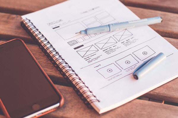
Establishing a visual hierarchy helps users find the information they need to make a decision. You can apply the right visual hierarchy to your site to influence users and make them react positively to your call-to-action.
Here's how you can create a powerful visual hierarchy:
- Perfectly placed conversion forms
- Call-to-action buttons need to be bigger, clear, and simple
- Use of high-quality images
- Brief and benefit-driven headline
- Use of power words to make your copy catchy and compelling
- A good layout that seamlessly moves eyes from one point to another
These design principles can improve the overall experience of your website in a way that users just don’t accomplish goals but also enjoy their visit to your site.
Use the right color combinations
Different color combinations convey different meanings and evoke different emotions. You can play with colors to get people to do exactly what you want.
For example, you can apply contrast psychology to highlight call-to-action buttons and to make headlines and texts noticeable and readable. Other important elements that you want to highlight should stand out from the rest of your site, too. Use the right color combination so that people can see them easily.
Use negative space effectively
Negative space is referred to as white space on a website.
In simple words, positive space has all the elements on your site whereas negative space refers to the empty space between paragraphs, sidebars, and texts.
Despite the name, negative space is valuable to the design of your website. Without it, your site will look cluttered.
Effective use of negative space is necessary to keep your website user-friendly and easy to navigate. So, avoid stuffing your website with too much information.
See Also: Web Design Strategy: How To Give New Life To Your Site
Good typography is critical
The right typography can enhance the readability of your content while optimizing your UI design. A good typography often goes unnoticed because it just makes sense. So, go for a simple yet bold typography that presents your content in a user-friendly way.
Here are some essentials of a good typography.
Consistency- Consistent use of kerning, typefaces, and formatting is essential to give your content a professional look and keep your users focused.
Hierarchy- Creating hierarchy is important to guide users through the content. For example, in web design, it has to be heading followed by subheading and then main copy.
Alignment- Alignment is important to keep the look of your web page unified. You can either settle for flush left alignment or flush right alignment to provide readers a stronger edge line to follow. As much as possible, refrain from choosing a centered alignment.
F Layout is the safest
A user’s natural pattern when browsing the internet follows the ‘F’ pattern. That makes it the safest and most effective website design to follow.
When visiting a site, visitors move their eyes from left to right, starting at the top of the screen. Next, they scan the page downwards to find the information they need. The bottom right of a web page gets the least amount of visibility.
Thus, to boost your site's conversion rate, you need to place all the important pieces of your website along with that “F” pattern. This will encourage users to take specific actions, like completing a purchase, signing up for a newsletter or downloading an e-book.
Make it mobile-friendly

A lot of people access the internet from their handheld devices. If your website is not mobile-friendly, then you're way behind.
If you want to increase your conversion rate, your website needs to be able to provide a seamless experience to users. Moreover, Google also prefers mobile-friendly websites. You can end up in a higher spot in the search results if Google likes you.
With that, optimizing your website for mobile is no more just an option but a must-do.
See Also: The Essential Elements of Modern Web Design
Final Thoughts
Lastly, remember the K.I.S.S (keep it simple stupid) rule for your web design. Keep it simple and make sure there are fewer distractions. The more aesthetically pleasing your website is, the higher its conversion.


Comments