7 Keys to DIY Graphic Design on No Budget
By SJW
May 8, 2008 • Fact checked by Dumb Little Man

Everyone talks about starting a business, launching a website, doing what you love, quitting your job, etc. That's great but regardless of what you may read, people do indeed judge a book by its cover. When you start that business or website, you will most likely need a logo or some kind of graphics to accompany your text.
For those of you that have the ideas and not the skills to design a new logo, poster, or cover page for your business plan, you can either dish out some money to have a pro do it or you can give it a shot yourself.
Clearly there is a time when a professional needs to get involved. However, I like doing it myself and I have a learned a lot in the process. Take these notes into consideration next time you have to get a creative project done on no budget:
- Think few and simple: A highly-trained, experienced graphic designer can integrate a mass of disparate material into a good-looking whole. I can't, so I go minimalist. With the words, too. Less is more. Most people overwrite by 10%-25%; try cutting a tenth to a quarter of your text.
- Every element you choose must reinforce your theme: An old-fashioned font on a technology announcement? Pink for something aimed at lawyers? Grey for something aimed at little girls? No. Just no. If it doesn't reinforce the theme, no matter how much you like it, don't use it. You can always use it for something else another time.
- Get one, or maybe two, really strong graphic elements from one of the many sites where artists more skilled than you make their work freely available. My favorites are:
- stock.xchg. Stock photographs like you'd get from a pay site, well organized and easy to search.
- flickr. Thousands of mostly amateur, but often very skilled, photographers post here, and many of them let you use their photos.
- the Open Clip Art Library. Usually well-drawn and often completely without restrictions on usage. Unfortunately, the site isn't searchable. You can download the whole library for free, but it's large.
- deviantART. More emphasis on painting, drawing and digital art and less on photography.
- everystockphoto and PicFindr, which are search sites that search a number of different free photography sites. I find everystockphoto to be the more useful of the two. (Often, though, the best photos I find turn out to come from stock.xchg or flickr anyway.)
Make sure you check the usage conditions before you use a piece from these sites, as they do vary both between and within the sites. Familiarize yourself with the various Creative Commons licenses and what they permit, require and prohibit. Stock.xchg has its own usage terms, and individual contributors sometimes add other requirement such as attribution, linking to them, informing them or even asking permission from them before you use the work. Look underneath the photo to be sure. Flickr uses the Creative Commons licenses, and you can search by CC license either on Flickr itself or on flickrCC, which presents the pictures in an easy-to-view format.
For deviantART you will usually need to contact the artist to ask about usage. It's always courteous to let the artist know you're using their work in any case. And if you leave a comment on the piece of art you used, you have the opportunity to link back to your own site and promote it.
- Use two, or maybe three, clean, legible fonts: A lot of amateur graphic design looks like an explosion in a font factory. One font for headings, one for body text, and maybe one other for special elements is the rule to go with. Look on your computer first – you probably have dozens of fonts already. If you don't have quite the right one, though, there are plenty of free font sites around. Two that are easy to use and well-organized are urbanfonts and better fonts.
- Use three, maybe four, well-matched colors: Hands down the best site I've found for harmonizing colors is EasyRGB. It's for web designers, but there's no reason you can't use it in other projects too. Pick a main color and then get EasyRGB to show you good matches for it.
- Use Inkscape to bring it all together: Inkscape is free software, and fairly easy to learn. You can do pretty much anything you need with it for basic graphic design.
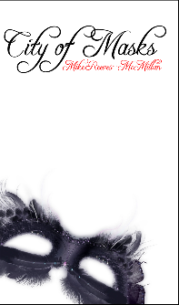
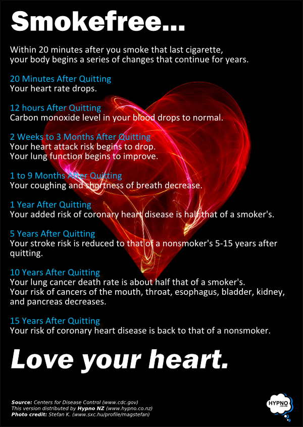
- Align the elements with each other so that the viewer's eye moves through them naturally and they seem related: I've used these principles to design several logos, a book cover for my novel (using an image from deviantART), and a poster for my stop-smoking clients (using an image from stock.xchg).
If you can afford it, of course, use a proper graphic designer; they're worth it. But zero-budget graphic design isn't as hard as you may have thought.
-Mike

