Color plays a crucial role in helping us evaluate and classify objects within seconds. If you think about how long you normally scan someone’s social media page before deciding if you want to check out more, you’d probably agree that choosing brand colors is critical.
Since the human eye is capable of distinguishing approximately 10 million colors, you have to be on point with your choice. When your chosen color fits your brand, your audience is more likely to instantly connect you with your services or product.
In making a choice, here are a few pointers to help you out.
Think of your medium
Before you start checking out various hues, think of the medium you will be using the most.
Curalate 2013 study showed that subdued, light and less saturated images posted to Instagram get considerably more likes than more saturated or dark counterparts. Images high in contrast and saturation prevail in print advertisement.
Decide if you want to energize or soothe
Cooler colors tend to soothe while warmer ones have a stimulating effect. It may seem easy to choose between putting your audience to sleep and keeping them wide awake. However, you need to be cautious in using red.
If your personal brand color is something close to red hot, it can overstimulate and exhaust your potential clients, employers or business partners.
Moreover, humans have evolved to pay attention to bright contrasting colors as a way of evading predatory fauna and poisonous flora. So, while bright orange or yellow against black can feel magnetizing for a second, they can also cause stress and tension fatigue long-term.
Pick a hue
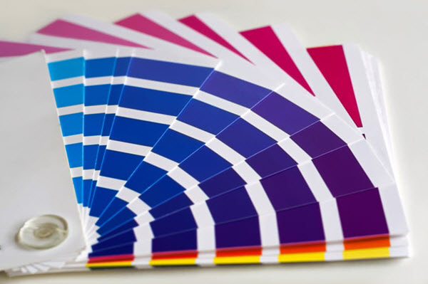
When choosing brand colors, look for what’s used most often in your industry or take a bold stand and use something uncommon.
Imagine an oil company using a green logo and marketing materials. That ought to get a second look but before taking a leap like that, ask yourself if that’s really the kind of attention you are looking for.
While you definitely should do an in-depth research, let’s look at a few common examples to get you started.
Green is associated with freshness and life as it is the prevailing hue in nature. Organic and eco-friendly brands, as well as environmental organizations, use this color to emphasize their commitment to the cause.
Blue is associated with trust, stability, and science. It's becoming a popular choice among consultancy firms, banks, and research institutions. It is also widely used for any brand that’s related to water.
Yellow is the color of the fun, summer, and sun. You can find it mostly in the entertainment industry to convey the joyous nature of a brand.
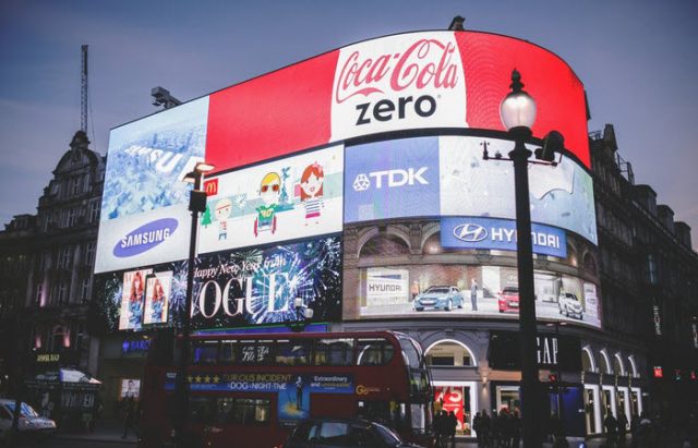
The color red typically represents power, passion, leadership or activity. It draws instant attention, making it excellent to use as a recurring accent in all your brand advertisement.
Brown and earthy tones are associated with a relaxed feeling. Pastels, meanwhile, add an ephemeral and tender feel.
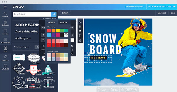
Here is a Crello Instagram template artboard that you can browse for professionally designed examples of color choices for dozens of businesses.
See Also: 5 Instagram Tools That Can Boost Brand Performance
Make sure it’s universally applicable
Arguably, being consistent with your brand color is as important than why you choose a particular color. Use it for all your brand's online presence and promotional items. Think how your online and offline brand materials will look like in the selected tone.
Don’t choose a color that doesn’t suit you or simply isn’t ‘you’. You will be the one seeing your brand color the most, so let it reflect your uniqueness.