How To Transform Your Logo Into A Piece Of Art
By contact informia
January 10, 2024 • Fact checked by Dumb Little Man

We all know just how important the logo is for any company or brand. You don’t have to listen to me rant on and on about the importance of the logo, how it is supposed to be memorable and evergreen and everything else. You know it better than I do.
That is why a lot of companies pay a hefty amount to a logo design company to make the logo as relatable, relevant, and sometimes mysterious as they can. Your company’s logo is supposed to tell your story. People should relate to it. It should have the right colors and geometry to be easily understandable and memorable.
It’s not like sitting down on your desk, drawing a circle, using a font to type in your company or brand’s name and voila! You have yourself a logo.
Oh no, no, no!
It takes much more effort than that.
That is why a lot of people must have told you to use a logo design service instead of doing it yourself. You may be good at business, sales, marketing, but if you are not on the up and up with the logo design world, you just might end up with an average logo that looks like a hundred others.
This is what happens when you use free logo maker websites and software. A totally uninteresting, uninspiring and boring logo that no one wants to look at.
So, the question is, whether you are a company or a logo designer, how do you ensure that your logo is not among the hundreds of logos out there that all look the same? How do you ensure that your logo stands out and catches the eye of the audience?
By……..wait for it…….turning it into art.
SAY WHAT NOW?
Yes, you heard me right. There are a million different ways that you can turn your logo into a piece of art that people will talk about for decades to come. It is difficult, but totally possible. Later in this article, we will discuss how you can do that and what are the elements that you will need to incorporate in order to do so.
But for now, let’s talk about how to begin. It’s not like you have a clear idea about designing your logo. So, experiment with various logo templates to get yourself warmed up first. It can also be the starting point of your journey towards making a killer and memorable logo design. It can give you an initial idea of where to begin and just might give you further ideas that you can adapt and incorporate later on.
Do you have a logo maker tool that's handy? Is there an online app? Make a few logos and circulate them among your friends and colleagues to find out what they think about them. They can suggest any edits that they think you might need. Getting your peers on your side is something that you really need.
So now that we’re done with the warm up exercises, let’s dive into the world of logo designing and see how you can make your logo stand out.
Do you know what a Visual Double Entendre is?
A double entendre is a figure of speech or anything else that can convey two different meanings. Simple as that. A visual double entendre is the same thing but the double meaning is conveyed visually. Some of the world’s most renowned logos use this element to increase the engagement level of their logos and people all around the world remember these logos for their wittiness.
Take for example the Amazon logo. Now who doesn’t know Amazon? At first glance, the logo has an arrow that goes from the ‘A’ in the beginning to the ‘Z’ in the middle and it looks like they are saying that they provide service with a smile. The thing that a lot of people miss is that the arrow is pointing from ‘A’ to ‘Z’, meaning that they have everything that you might ever need or want.

Another great example is the Baskin Robbins logo that uses the curves of the letter ‘B’ and the straight line of the ‘R’ to show their audience just how many flavors they actually have.
The Importance of Colors
One of the most essential decisions that people tend to make about their logos is the colors that they want to use. You might think that it is an easy decision, but it’s not.
You may or may not know this, but every color conveys a deep meaning that resonates with the audience and if you don’t get it right, you just might end up losing your audience instead of gaining one. Colors can communicate various messages and ideas.
For example, red is the color of danger, but it is also the color of excitement and Coca Cola has used it to great effect.

There is a rich palate of colors that you can truly explore before selecting one or more for your logo. Because once you have a logo, you might not be able to make a lot of changes to it, much less change it for something else. The colors that you use can either grab the audience’s attention and pull them in or they can push them away. The best thing about the color palate is that it is completely up to you. You can even choose a gray scale logo if you think it works.
Avoid the Cliches
Just like every other industry, the logo design industry is also prone to various trends and fads that come and go. What a lot of good businesses do is to follow these trends and fads and generate a logo according to them. What they don’t remember is that trends last for a little while and then fade away.
It doesn’t mean that you stay away from every new thing that enters the market. Study them, do your research on them, but also make sure that you don’t jump on the bandwagon for the pretext of keeping up with the times. It accomplishes nothing more than a bunch of similar looking logos created by different people.
Own Your Logo
Everyone owns a logo, right? So, what am I talking about here?
When I say ‘Own your logo’, I mean that instead of taking into account the latest trend and going for it, you should do your research about the company or the brand. Get to know their products and services, their background story, and then come up with something that reflects those things. That will resonate more with the viewers and they will relate with it instantly.
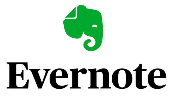
As an example, let me show you the Evernote logo.

If you look at it, it is just an elephant head which has got nothing to do apparently with the app. Or does it? Remember anything about elephants and their memories? Now check out the way the trunk is curled and the way the ear is marked/folded. That is something that the viewers can immediately connect with.
Say It with the Fonts
Sometimes you don’t need to put so much effort into the colors and the design of it. Sometimes you can do it all with the typeface. Give your simple and minimalistic logo a creative and unique font to make it awesome and super memorable. As an example, I will have to go back to the Coca Cola logo. The font became so famous that a lot of other companies started stealing it and using it as their own typeface in their logos. Now that is the kind of uniqueness that every logo designer is going for.
Go Negative
Yup! You heard me right. You can use the negative space in your logo to create illusions and tricks just like a logo with a double entendre. Instead of talking about it, let me just show you what I mean.
Do you see the hidden arrow between the ‘E’ and the ‘x’? Now if that is not an ingenious idea, I don’t know what is. The use of negative space in the FedEx logo is amazing.
Now that you know how negative space can be used, check out the NBC logo and see if you can figure out how they have used the negative space.
This one is pretty easy, right?
Summing It Up
Knowing these things can greatly help a logo designer, whether you are working in-house or as a contractor. You can show your client just how much effort you have actually put into the logo and blow their minds away.
See Also: Building Your Personal Brand: 3 Ways To Stand Above The Noise


